I'm an idiot. I missed the most important -- and possibly the most influential -- art show of 2007 because I believed poisonous rumours circulating about its awfulness. Documenta 12, four months after its closure, is acting like a classic sleeper, a grower, an earworm. Like a song that resonates more and more beautifully in retrospect, Ruth Noack and Roger M. Buergel's oblique, idiosyncratic art survey in Kassel turns out to have been the most significant exhibition in a year crammed with big, bold, flashy international ones. It's done it by being quite the opposite of flashy: quiet, marginal, revisionist, shy, off-kilter, evasive, perverse, self-indulgent, didactic. The extent to which D12 divided opinion is a measure of its importance. Some immediately hated this show, others, later, were quietly intrigued. Personally, I'm fascinated by things this divisive. They're often bellweathers, barometers, watersheds, auguries, agar jars.

Luckily, Documenta has been documented. We can still glimpse it in videos, websites, catalogues, slideshows, photo archives, reviews. In fact, let's do that right now. You might want to keep your finger poised over the pause button during this compressed five minute visit:
[Error: unknown template video]
Here's a big archive of photos of D12. And here's Tokyo curator Roger McDonald's take, in the form of a slideshow with commentary.
"There were actually a lot of small-scale works in tiny cases and glass frames. Maybe this again encouraged me to experience the show as something quite homely, like the curators' wunderkammer -- cabinet of curiosities," says McDonald. "It's kept me thinking and wondering longer than Venice. Maybe this lingering sensation is what many critics found so irritating -- in an age when exhibitions must be packaged and consumed quickly, the curators of Documenta 12 didn't seem to want to follow the rules."
 And irritated some of the critics were. The British broadsheet ones, particularly. The Daily Telegraph's Richard Dorment (he's written a book about Whistler, you know) called D12 "the single worst art exhibition I have ever seen anywhere, ever... a show organised by two pseuds and intended for graduate students and people who don't really like visual art at all".
Adrian Searle in The Guardian didn't like it much better. "Documenta 12 is a disaster," he said, deriding the curators' perverse streak of autocratic, pedagogic intent, their "quizzical attitude to painting", the strangely subdued atmosphere, the absence in person of Harvey Keitel (who featured in one of the videos), the guards "who inform you not to get too close, not to breathe on the glass, not to lean against the walls, not to carry a bag, not to point, sneer, laugh or break wind".
British art magazine Studio International fingered one possible reason the UK press were so down on the show: "It seems that Roger M Buergel and Ruth Noack were on a voyage of several years (or so it was) to find a lost magic kingdom of modernity. This, in their view, involves not a quest into the future but a rummaging in the detritus of history. They wholesomely (one cannot say wholeheartedly) impose that the curatorial model of today is now a covert neo-liberal model compromised by globalist capitalism, for which instead they seek to consolidate antiquated Marxist tendencies before they vanish forever."
Aha, "antiquated Marxist tendencies". Buergel is, after all, the man who, in 2000, staged an exhibition subtitled "Art in conflict with the international hyper-bourgeoisie and the national petty bourgeoisie". To combine this Marxist terminology with aristocratic gourmet tastes was unforgivable: at the press conference launching D12 Buergel unveiled two tidbits from the show: a Bach cantata accompanied by a deaf choir and a chef who made algae brittle and chocolate with wasabi.
 The curators quizzed for Frieze's end of year rundown had had a few months to mull the summer's blockbuster shows. By now the earworm was spinning its magic; many of them decided they liked the show:
"D12 was provocative in good and bad ways... it was enlightening to see the repositioning of so many key figures, especially women artists from the 1960s and 70s."
Connie Butler
"D12 was a wildly subjective curatorial indulgence, which is what made it so interesting... I can't help feeling that the curators' disregard for exhibition-making might come to be seen as an influential watershed of some kind."
Matthew Higgs
"D12 was my most rewarding exhibition experience this year, by some distance... it was a project that felt urgent and relevant."
Mark Sladen
"The discussions surrounding Documenta, combined with the ambition of the curators to pursue such an idiosyncratic agenda, were by far the most interesting social production witnessed."
Polly Staple
Some kind of consensus emerging there -- the "worst show of the year" may just have been the best.
But isn't that always the way? It's the things that stretch and challenge and intrigue us, the things capable of changing our minds, changing our ways of seeing, that end up being the most valuable to us.

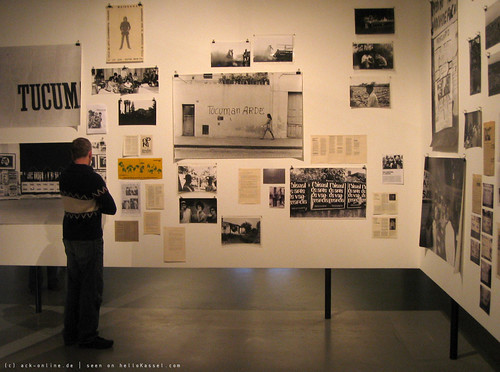
Just looking at the slideshows, videos and photos, I can see that one of the things D12 was trying to do was re-make the art history of the last fifty years, tilting the canon towards quietly beautiful, purely colourful, extra-anglospheric, politically radical artists. Didactic displays documented the Grupo de Artistas de Vanguardia, or the dot paintings of Danish colourist Poul Gernes, or quiet and subtle Belgian Lili Dujourie, or Inuit artist Annie Pootoogook, who made this wonderful drawing:

Then there was Japanese artist Aoki Ryoko, whose work I saw once in a museum in Hiroshima:

Or David Aradeon's Movement of Forms, Antecedents of Afro-Brazilian Spaces, a table laid out with restrained costume drawings. Or Gerwald Rockenschaub's gorgeous flat colours and blocky shapes. Or Swedish video artist Johanna Billing's film (put together during a residency at Edinburgh's Collective Gallery) of boating on the Firth of Forth. Or the late Jo Spence's documentation of her terminal cancer:

Even the graphic design (by Martha Stutteregger indoors and Vier5 out) was oblique and mysterious, with something rational but also Rudolf Steiner-ish about it. This was, as Artnet put it, "a Documenta of peripheral spaces sparingly accented by discreet artworks" -- and signed with polystyrene blocks featuring a font based on Buergel's own handwriting.
Somehow the wrongness-becoming-a-new-rightness, old-taboo-becoming-new-template, marginal-becoming-canonical element here reminds me of Mike Meiré's work -- and how gobsmacked it's left designers, especially those on the other side of the pond.
But don't be too quick to sneer -- the object of your derision may just turn out to be an earworm, or even the future of the medium. "If you're familiar with art and design," wrote Michael Bierut in Design Observer, "you know the perils of condemning the shock of the new. After all, no one wants to risk being one of the bourgoisie sneering at the unveiling of Les Demoiselles D'Avignon or booing at the debut of Le Sacre du Printemps."
Luckily, Documenta has been documented. We can still glimpse it in videos, websites, catalogues, slideshows, photo archives, reviews. In fact, let's do that right now. You might want to keep your finger poised over the pause button during this compressed five minute visit:
[Error: unknown template video]
Here's a big archive of photos of D12. And here's Tokyo curator Roger McDonald's take, in the form of a slideshow with commentary.
"There were actually a lot of small-scale works in tiny cases and glass frames. Maybe this again encouraged me to experience the show as something quite homely, like the curators' wunderkammer -- cabinet of curiosities," says McDonald. "It's kept me thinking and wondering longer than Venice. Maybe this lingering sensation is what many critics found so irritating -- in an age when exhibitions must be packaged and consumed quickly, the curators of Documenta 12 didn't seem to want to follow the rules."
And irritated some of the critics were. The British broadsheet ones, particularly. The Daily Telegraph's Richard Dorment (he's written a book about Whistler, you know) called D12 "the single worst art exhibition I have ever seen anywhere, ever... a show organised by two pseuds and intended for graduate students and people who don't really like visual art at all".Adrian Searle in The Guardian didn't like it much better. "Documenta 12 is a disaster," he said, deriding the curators' perverse streak of autocratic, pedagogic intent, their "quizzical attitude to painting", the strangely subdued atmosphere, the absence in person of Harvey Keitel (who featured in one of the videos), the guards "who inform you not to get too close, not to breathe on the glass, not to lean against the walls, not to carry a bag, not to point, sneer, laugh or break wind".
British art magazine Studio International fingered one possible reason the UK press were so down on the show: "It seems that Roger M Buergel and Ruth Noack were on a voyage of several years (or so it was) to find a lost magic kingdom of modernity. This, in their view, involves not a quest into the future but a rummaging in the detritus of history. They wholesomely (one cannot say wholeheartedly) impose that the curatorial model of today is now a covert neo-liberal model compromised by globalist capitalism, for which instead they seek to consolidate antiquated Marxist tendencies before they vanish forever."
Aha, "antiquated Marxist tendencies". Buergel is, after all, the man who, in 2000, staged an exhibition subtitled "Art in conflict with the international hyper-bourgeoisie and the national petty bourgeoisie". To combine this Marxist terminology with aristocratic gourmet tastes was unforgivable: at the press conference launching D12 Buergel unveiled two tidbits from the show: a Bach cantata accompanied by a deaf choir and a chef who made algae brittle and chocolate with wasabi.
The curators quizzed for Frieze's end of year rundown had had a few months to mull the summer's blockbuster shows. By now the earworm was spinning its magic; many of them decided they liked the show:"D12 was provocative in good and bad ways... it was enlightening to see the repositioning of so many key figures, especially women artists from the 1960s and 70s."
Connie Butler
"D12 was a wildly subjective curatorial indulgence, which is what made it so interesting... I can't help feeling that the curators' disregard for exhibition-making might come to be seen as an influential watershed of some kind."
Matthew Higgs
"D12 was my most rewarding exhibition experience this year, by some distance... it was a project that felt urgent and relevant."
Mark Sladen
"The discussions surrounding Documenta, combined with the ambition of the curators to pursue such an idiosyncratic agenda, were by far the most interesting social production witnessed."
Polly Staple
Some kind of consensus emerging there -- the "worst show of the year" may just have been the best.
But isn't that always the way? It's the things that stretch and challenge and intrigue us, the things capable of changing our minds, changing our ways of seeing, that end up being the most valuable to us.
Just looking at the slideshows, videos and photos, I can see that one of the things D12 was trying to do was re-make the art history of the last fifty years, tilting the canon towards quietly beautiful, purely colourful, extra-anglospheric, politically radical artists. Didactic displays documented the Grupo de Artistas de Vanguardia, or the dot paintings of Danish colourist Poul Gernes, or quiet and subtle Belgian Lili Dujourie, or Inuit artist Annie Pootoogook, who made this wonderful drawing:
Then there was Japanese artist Aoki Ryoko, whose work I saw once in a museum in Hiroshima:
Or David Aradeon's Movement of Forms, Antecedents of Afro-Brazilian Spaces, a table laid out with restrained costume drawings. Or Gerwald Rockenschaub's gorgeous flat colours and blocky shapes. Or Swedish video artist Johanna Billing's film (put together during a residency at Edinburgh's Collective Gallery) of boating on the Firth of Forth. Or the late Jo Spence's documentation of her terminal cancer:
Even the graphic design (by Martha Stutteregger indoors and Vier5 out) was oblique and mysterious, with something rational but also Rudolf Steiner-ish about it. This was, as Artnet put it, "a Documenta of peripheral spaces sparingly accented by discreet artworks" -- and signed with polystyrene blocks featuring a font based on Buergel's own handwriting.
Somehow the wrongness-becoming-a-new-rightness, old-taboo-becoming-new-template, marginal-becoming-canonical element here reminds me of Mike Meiré's work -- and how gobsmacked it's left designers, especially those on the other side of the pond.
But don't be too quick to sneer -- the object of your derision may just turn out to be an earworm, or even the future of the medium. "If you're familiar with art and design," wrote Michael Bierut in Design Observer, "you know the perils of condemning the shock of the new. After all, no one wants to risk being one of the bourgoisie sneering at the unveiling of Les Demoiselles D'Avignon or booing at the debut of Le Sacre du Printemps."
roger
Date: 2008-01-15 09:32 am (UTC)Re: roger
Date: 2008-01-15 11:33 am (UTC)"Although there were no biennials in Japan in 2007, the Japanese art scene was characterized by a restoration of public interest in contemporary art..."
So when is the next major Japanese show? There's another Yokohama coming up, isn't there? If Matsui is right, it should be a good one, no?
Re: roger
Date: 2008-01-15 03:30 pm (UTC)Re: roger
Date: 2008-01-15 03:48 pm (UTC)There was also the Biwako Biennial at Omihatchiman.
Biwako Bienniale
Date: 2008-01-15 06:36 pm (UTC)Re: Biwako Bienniale
Date: 2008-01-15 08:19 pm (UTC)Yes, Hisae and I were at the previous one. I even covered it (http://imomus.livejournal.com/40705.html) with lots of video here on Click Opera! It was good -- a very refreshing scale, and some lovely architecture (re-purposed sake factories, old wooden buildings by the canal, traditional tea houses, a very 1950s-style cinema).
Re: Biwako Bienniale
Date: 2008-01-16 02:32 pm (UTC)(no subject)
Date: 2008-01-15 09:51 am (UTC)"tilting the canon towards quietly beautiful, purely colourful, extra-anglospheric, politically radical artists."
Weirdly, its the stuff opposed to this (and there was lots of it) that caught most of my attention:
I had a really hard time picking screenshots, there was so much fantastic stuff displayed.
(no subject)
Date: 2008-01-15 11:41 am (UTC)It's funny, the same critic loved (http://www.telegraph.co.uk/arts/main.jhtml;jsessionid=V3TJZPE2RLQTNQFIQMFCFGGAVCBQYIV0?xml=/arts/2002/06/12/badorm12.xml) the 2002 Documenta. Then again, the list of artist names in that make it sound incredibly safe and old guard compared to the 2007 edition. On Kawara, Leon Golub, William Kentridge and Jeff Wall supplying "one of the most beautiful and touching works of art I've seen in years, a masterpiece".
(no subject)
Date: 2008-01-15 07:52 pm (UTC)(no subject)
Date: 2008-01-16 10:31 am (UTC)Sorry, I live in Vancouver and make photo-based work. Its an Oedipal/playa-hating thing.
(no subject)
Date: 2008-01-16 10:33 am (UTC)Sorry, I live in Vancouver and make photo-based work. Its an Oedipal/playa-hating thing.
graphic design
Date: 2008-01-15 10:39 am (UTC)the print design, like the catalogue and most posters, are indeed the work of Swiss typographer Martha Stutteregger (http://www.stutteregger.com/en/projects/).
Although the guiding system was done by vier5 (http://vier5.de/) the German designers Marco Fiedler and Achim Reichert, based in Paris.
Apart from their works for the Documenta (http://vier5.de/10/documenta_crowncap.html) or the Museum für angewandte Kunst Frankfurt (http://vier5.de/10/museum1.html) they also have a fashion label (http://www.clausrichter.net/index.php/2006/07/09/paris-04-vier5-fashion-department/) and are publishing the Fairy Tale (http://www.fairytale-magazine.com/) magazin.
So overall it seems like we had a nice talk between Apollo and Dionysus (http://imomus.livejournal.com/276919.html) going on there at Documenta.
Re: graphic design
Date: 2008-01-15 11:35 am (UTC)Re: graphic design
Date: 2008-01-15 11:46 am (UTC)you really should check it out.
IDEA 326
http://203.138.133.158/cgi-bin/book/catalog.cgi?language=jp&item=326
Atmosphere
http://gas.main.jp/atmosphere/2007/07/info_vier5_for_documenta_12_1.html
photos
http://www.flickr.com/photos/9622437@N07/
Re: graphic design
Date: 2008-01-15 12:14 pm (UTC)is what made some of the critics talk about the non-navigability of the Documenta site. It's funny, there's a lot of talk of the avant garde being dead, and everything being mainstreamed within seconds of its arrival. And yet you just have to give an art critic a slightly homemade, handmade sign system and he's immediately spluttering with rage. As long as there's conservatism and invisible consensus, there will be avant garde work to outrage it and make it visible.
Re: graphic design
Date: 2008-01-15 12:25 pm (UTC)Personally, I love to see new ugliness, because it means new beauty is on the way too. They ride together.
Re: graphic design
Date: 2008-01-15 01:35 pm (UTC)Re: graphic design
Date: 2008-01-15 01:47 pm (UTC)"..."guards" (that's what their silly bib-like outfits have written on them)..."
Re: graphic design
Date: 2008-01-15 03:01 pm (UTC)Many of the fonts vier5 have created are documented in the book "VIER5. Modern Typefaces.".
Also there is this website ForHomeOrOfficeUse (http://www.forhomeorofficeuse.com/overview.html) where sample sheets of lots of experimental fonts can be downloaded (the sample above is "0031aConvertToPath-Italic")
I very much like how it seems that their work cannot be related to in a neutral way (the same love/hate disconnectedness shows uphere (http://www.designobserver.com/archives/023759.html) und hier (http://www.slanted.de/node/125) - as we have it concerning the Documenta as a whole) (http://kunstbuchhandlung.de/katalog/lkubu/lkubu-1363573.htm) ()
(no subject)
Date: 2008-01-15 11:11 am (UTC)definitely the most interesting show i've seen last year (or the year before that or before before that)
a bit sad that in order to get to asomething meaningful the curators had to by and large resort to actual art from times when art was still considered meaningful but what's 20 - 30 yaers anyway in the long run.
that is modernity our antiquity? thesis had me thinking for most of the 2nd half of 2007. so poignant on so many levels.
the mags are great not last in the way they include so much stuff that wasn't in the show making the message all the more relevant.
(i really wanted to insist more you should go and see it at the time but i didn't have much to back up my case then)
(no subject)
Date: 2008-01-15 11:43 am (UTC)Does this make D12 the Retro Necro Documenta, then?
(no subject)
Date: 2008-01-15 04:24 pm (UTC)BA--KA
Date: 2008-01-15 12:35 pm (UTC)The idea that art has been relegated to the year of it's introduction/release/recognition is fucking ridiculous.
Is EVERYTHING now a consumable, dated, packaged? If so, I've got a jock strap, worn extensively and only in 2007, super-special due to the unseasonably HOT summer of 2007, and flash-frozen during peak ripeness.. Any takers?
Re: BA--KA
Date: 2008-01-15 01:04 pm (UTC)But the fact is that we do live in our times, and even our view of the past is a perspective conditioned by how "now" feels. Documenta 12 was very aware of that, and in fact foregrounded its own revisionism, bringing back a whole host of sublimated, forgotten, marginal artists from the last 50 years as part of its curatorial effort. This "new now" contained a "new then".
(no subject)
Date: 2008-01-15 01:22 pm (UTC)Why TV is ignoring contemporary art (http://www.guardian.co.uk/media/2008/jan/15/television.art). I'd say the real reason is that one set of elite bourgeois (TV producers) absolutely will not cover the activities of an even more elite, experimental and advanced one (art curators). It's a small difference too far. Even if everyone in Britain goes to Tate Modern and talks about nothing else, there still won't be TV programmes about contemporary art, for this reason.
(no subject)
Date: 2008-01-15 01:33 pm (UTC)(no subject)
Date: 2008-01-15 01:45 pm (UTC)a) change television for the better
b) change art for the worse (think YBA meets Big Brother).
(no subject)
Date: 2008-01-16 03:00 am (UTC)aaaaguuughhhhh!
thanks a lot, you've just given me fodder for untold nightmares!
(no subject)
Date: 2008-01-16 06:23 am (UTC)Tv does, sometimes, create programing about art. PBS has been running a great series on contemp art here in the states I've been following. But it's not because Tv, or film or any of the media industries are consciously poo-pooing something... It's because they don't see a profit in it.
Additionally, I do think it's true that the film/tv industry is very different from the art industry. The biggest overlap in temperament I've found is within the documentary community. Otherwise, huge budget media must answer to its resources, which long ago created conventions not friendly to the kind of exploratory, abstract, challenging modes of art.
I also want to say, who says some tv programming isn't contemporary art, in and of itself?
(no subject)
Date: 2008-01-16 08:01 am (UTC)I'd have to be categorical and say that, although art could still be art if it appeared on the small screen, it would have to first have been legitimized by the art system to qualify. Anything commissioned and produced by the TV system cannot be art as recognized within the art system -- unless it's re-appropriated by an artist recognized within the art system.
I think this wouldn't just apply to the lines of legitimation, but also to the lines of finance: TV would want to use the art free of charge, and the art world probably wouldn't bother clearing the copyright on the TV it had reappropriated. They would both want each other to finance their own products through their own systems. Their lack of desire to pay for each other's produce would represent a sense that they weren't responsible for each other's production.
Here's an idea for a Changing Places show, though: put gallery curators in charge of TV for a day, and TV producers in charge of the galleries. See how they'd fill the space.
(no subject)
Date: 2008-01-16 08:36 am (UTC)Personally, I'd really like to see art engage with the (Western?) conventions industry films and tv have created for themselves. (The man becomes a hero, the woman goes through hell, etc. etc.) There's a sort of meta-mythos there that I never see touched from the art world, though it's sometimes engaged with within the industry. (More in film than tv though, still!)
I understand it's not functioning actively within the contemporary art scene--I know they don't go to the same parties--but I'm not sure how comfortable I am removing wholesale the artistic talents of those I know.
(no subject)
Date: 2008-01-16 10:44 am (UTC)More a click than a comment
Date: 2008-01-15 11:08 pm (UTC)Thomas S.
Metronome
Date: 2008-01-16 02:59 am (UTC)(no subject)
Date: 2008-01-16 05:07 am (UTC)(no subject)
Date: 2008-01-16 05:26 am (UTC)(no subject)
Date: 2008-01-16 05:31 am (UTC)Also, I like the new layout!
(no subject)
Date: 2008-01-16 06:00 am (UTC)(no subject)
Date: 2008-01-17 02:00 am (UTC)'Stupid people think it's cool. Smart people think it's a joke; also cool!'
;-)
(no subject)
Date: 2008-01-16 06:17 am (UTC)(no subject)
Date: 2008-01-16 08:03 am (UTC)(no subject)
Date: 2008-01-16 08:32 am (UTC)i think much of the controversial nature of con-art is that the audience is made so responsible for the meaning of the piece. that kind of engagement seems to excuse or nearly render obsolete the artist in some situations. (though, i don't think it ever truly does, because a piece of art is the object of a subjectivity, the object being an access port to it...)
i have a lot of faith in deconstructionist forget-the-author readings. i think they are healthy for us!