Helvetica as movie star
Mar. 28th, 2007 10:33 amIt may have been Cheshire Dave who first had the idea to make movies with typefaces as the central protagonists. His Etched in Stone stars the Trajan font which so perfectly encapsulates Hollywood's imperial aspirations (Trajan is, appropriately enough considering our theme these last couple of days, a murderer -- of producers who use other fonts, not national film industries). Dave's Behind the Typeface features a somewhat anthropomorphized Cooper Black (is he really meant to sound African-American?).

For those of us who prefer our fonts -- and our films -- a bit more post-protestant and understated, the new documentary by Gary Hustwit, Helvetica, might be the kind of thing we'd rather make lines around thegrid block for. And that's exactly what typeface maniacs have been doing -- a recent screening of Helvetica saw 300 seated and a further 200 turned away.

Luckily there's a clips page where you can see a video montage of random Helvetica glimpsed on the streets of Berlin (my own montage is above -- we're spoiled in this city), or Experimental Jet Set talking about Modernism's subversive dialectical side, or even my design commentary mentor Rick Poynor talking about how type "casts its secret spell".
 But perhaps the most interesting clip, for me, was one which apparently didn't make it into the final film, an outtake in which Massimo Vignelli talks about the beautiful New York subway map he and his Unimark partner Bob Noorda designed in 1972. You can see the map here, and read Michael Bierut's account of its creation here.
Bierut compares Vignelli's map to Marxism (maybe that's why conservative pundit Michael Blowhard, in the comments section, tells us he doesn't like it!): "It was as logically self-contained as Marxism. And, like Marxism, it soon ran afoul on the craggy ground of practical reality." The problem, Bierut explains, was that Vignelli's map followed Henry Beck's famous London Underground map in the way it privileged graphic clarity over geographical accuracy. But because of New York's ultra-rational grid plan, "the geographical liberties that Vignelli took with the streets of New York were immediately noticable, and commuters without a taste for graphic poetry cried foul".
 Vignelli certainly has a taste for poetry. "I think it's the most beautiful spaghetti work ever done!" he says of his own map. He also has some theories about why it was replaced by the ugly hodge-podge of a subway map we have today:
"The fact... the reality is that 50% of humanity is visually oriented, and 50% of humanity is verbally oriented. So the visually oriented people have no problem reading any kind of map including, you know, road maps. And the verbal people, you know, they can never read a map. So it's just because of that dichotomy between one and the other. But the verbal people have one great advantage over the visual people. They can be heard. And that's why they changed this map. They start to complain, these people, opening their mouths, in vain, until the beautiful map was substituted by the junky one."
Not only was Vignelli's beautiful map rejected, but now, looking back at it, he thinks it was a mistake to put Helvetica on it at all. He thinks he should have made it even more abstract and systematic, just a sinuous diagram of flowing colours without any reference to the real geography of New York. And his punishment for saying this seems to have been a further excision: the banishment of his map from the Helvetica film.
For those of us who prefer our fonts -- and our films -- a bit more post-protestant and understated, the new documentary by Gary Hustwit, Helvetica, might be the kind of thing we'd rather make lines around the
Luckily there's a clips page where you can see a video montage of random Helvetica glimpsed on the streets of Berlin (my own montage is above -- we're spoiled in this city), or Experimental Jet Set talking about Modernism's subversive dialectical side, or even my design commentary mentor Rick Poynor talking about how type "casts its secret spell".
But perhaps the most interesting clip, for me, was one which apparently didn't make it into the final film, an outtake in which Massimo Vignelli talks about the beautiful New York subway map he and his Unimark partner Bob Noorda designed in 1972. You can see the map here, and read Michael Bierut's account of its creation here.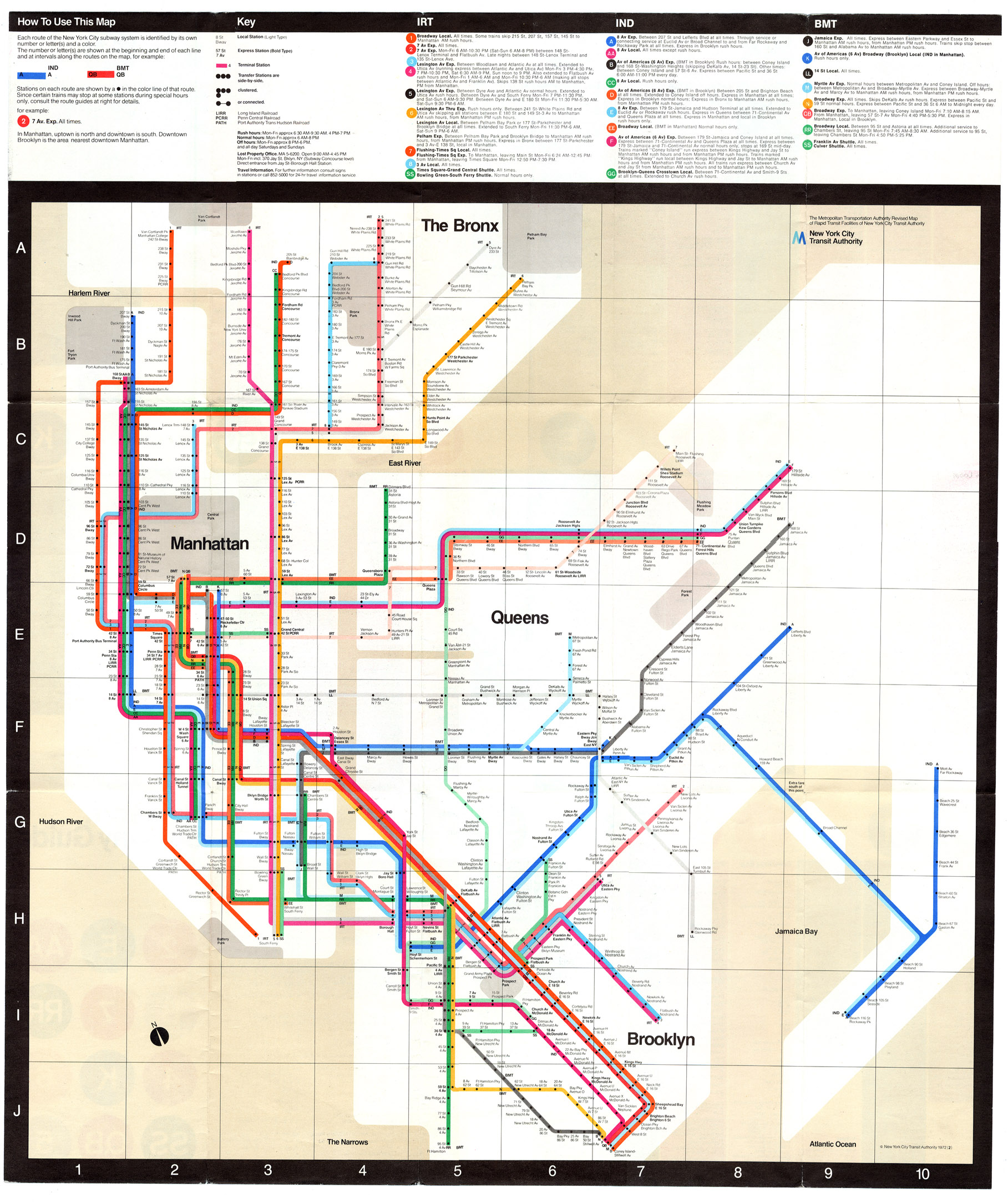
Bierut compares Vignelli's map to Marxism (maybe that's why conservative pundit Michael Blowhard, in the comments section, tells us he doesn't like it!): "It was as logically self-contained as Marxism. And, like Marxism, it soon ran afoul on the craggy ground of practical reality." The problem, Bierut explains, was that Vignelli's map followed Henry Beck's famous London Underground map in the way it privileged graphic clarity over geographical accuracy. But because of New York's ultra-rational grid plan, "the geographical liberties that Vignelli took with the streets of New York were immediately noticable, and commuters without a taste for graphic poetry cried foul".
Vignelli certainly has a taste for poetry. "I think it's the most beautiful spaghetti work ever done!" he says of his own map. He also has some theories about why it was replaced by the ugly hodge-podge of a subway map we have today:"The fact... the reality is that 50% of humanity is visually oriented, and 50% of humanity is verbally oriented. So the visually oriented people have no problem reading any kind of map including, you know, road maps. And the verbal people, you know, they can never read a map. So it's just because of that dichotomy between one and the other. But the verbal people have one great advantage over the visual people. They can be heard. And that's why they changed this map. They start to complain, these people, opening their mouths, in vain, until the beautiful map was substituted by the junky one."
Not only was Vignelli's beautiful map rejected, but now, looking back at it, he thinks it was a mistake to put Helvetica on it at all. He thinks he should have made it even more abstract and systematic, just a sinuous diagram of flowing colours without any reference to the real geography of New York. And his punishment for saying this seems to have been a further excision: the banishment of his map from the Helvetica film.
(no subject)
Date: 2007-03-28 08:54 am (UTC)Sorry, but as a graphic designer I must be picky on fonts.
(no subject)
Date: 2007-03-28 09:03 am (UTC)(no subject)
From:(no subject)
From:(no subject)
From:(no subject)
From: (Anonymous) - Date: 2007-03-28 12:20 pm (UTC) - Expand(no subject)
From:(no subject)
From:(no subject)
From:(no subject)
Date: 2007-03-28 12:25 pm (UTC)http://en.wikipedia.org/wiki/DIN_1451
Pretty similar although the ascenders look just a hair bigger. What do you think?
(no subject)
From:Vignelli Müller Brockman
Date: 2007-03-28 09:23 am (UTC)The Müller-Brockmann posters are set in Akzidenz grotesk, by the way.
ƒ
Re: Vignelli Müller Brockman
Date: 2007-03-28 09:25 am (UTC)Re: Vignelli Müller Brockman
From:Re: Vignelli Müller Brockman
From: (Anonymous) - Date: 2007-03-28 10:49 am (UTC) - ExpandRe: Vignelli Müller Brockman
From:Re: Vignelli Müller Brockman
Date: 2007-03-28 08:43 pm (UTC)http://en.wikipedia.org/wiki/Akzidenz_Grotesk
http://en.wikipedia.org/wiki/Helvetica
also:
in the late 50s, at the same time Miedinger was working on the mods to the 1896 AG (and Lange renewing AG for Berthold) for Haas Matthew Carter was making the same in England for Design Research Unit's sign scheme for Heathrow Airport.
what's important about these projects is their "programmatic" nature, a modular set of variants that would ensure a rich all-purpose palette with a single purchase of both display + text (metal) faces from a single manufacturer. the famous Univers diagram in fact appears first in Gerstner's Designing Programmes to describe the new Berthold AG variants. all of these are joined together by a new sensibility, and you choice of AG or HG had more to do with what was available at your printers.
"AG is Helvetica for snobs" Phil Baines
_ Sebastian
(no subject)
Date: 2007-03-28 11:11 am (UTC)i can't wait to see this film!
(no subject)
Date: 2007-03-28 04:06 pm (UTC)(no subject)
From:(no subject)
From:(no subject)
From:'Cheshire Dave'
Date: 2007-03-28 11:47 am (UTC)At one point we had Big Steve, Little Steve, Medium Steve, London Steve, Long Dave, Short Dave, Little Gay Dave and numerous other variations on the themes.
I wonder if a certain generation were just uncreative in choosing their baby boy names!
(no subject)
Date: 2007-03-28 12:18 pm (UTC)(no subject)
Date: 2007-03-29 05:40 am (UTC)(no subject)
Date: 2007-03-28 12:29 pm (UTC)http://en.wikipedia.org/wiki/List_of_public_signage_typefaces
http://lmnop.blogs.com/lauren/2006/10/americas_most_f.html
PS: Be glad your city, like many American cities, isn't littered with COMIC SANS!
http://www.bancomicsans.com/home.html
(no subject)
Date: 2007-03-28 12:45 pm (UTC)(no subject)
From:(no subject)
From:(no subject)
From:(no subject)
From:(no subject)
From:(no subject)
Date: 2007-03-28 02:46 pm (UTC)Visual/verbal binary and reading? Try some visual/concrete poetry over at the Sackner archive:
http://www.rediscov.com/sacknerarchives/
V.B.
map vs. diagram
Date: 2007-03-28 03:20 pm (UTC)Helvetica isn't as attractive and useful as other sans serifs, I think. Something awkward in its details. But then Univers often feels over-resolved, clinical--although it can be very appealing in its heavier weights.
Re: map vs. diagram
Date: 2007-03-28 04:23 pm (UTC)Re: map vs. diagram
From:accents?
Date: 2007-03-28 03:37 pm (UTC)Then again, I had a woman from France tell me my accent sounds British when it's none-more-Montreal...so i guess it depends on the intent of the creators.
I've a verdana girl myself
Date: 2007-03-28 04:20 pm (UTC)I'd like to see a citation for this assertion
I wouldn't call it "verbally" oriented, I would call it aurally-oriented. Because people who take info through their ears are also much better at music
But where does this 50/50 split come in? I'd say it's more like 70/30 because I think more people take information visually
I am very visual, my aural skills are weak. When I meet someone and they say their name, I have to see it spelled out in my mind to remember it (wonder what font that is in my head when I see their name?) If it's a name I can't spell, they have to spell it for me, if I am to remember it, because I have trouble remembering sounds sometimes. I hate talking on the phone because I do not have my visual cues. Aural friends who call me on the phone often don't identify themselves because they forget that not everyone can immediately recognize them by their voice
Re: I've a verdana girl myself
Date: 2007-03-29 05:53 am (UTC)helvetica
Date: 2007-03-28 04:26 pm (UTC)http://www.saulbass.tv/
Modern revision
Date: 2007-03-28 04:32 pm (UTC)http://kickdesign.com/mapcomparison/
I think it uses a very mid-2000s style of typeface, a sort of less-artistic, more down-to-business, rigid font for station names and a retro italic block style for neighborhood names.
Technically I have problems with the design: too cluttered colorwise, difficult to discern transfers, irresponsible usage of symbols. I'm curious to hear from those with formal design education especially.
beeautiful
Date: 2007-03-28 04:52 pm (UTC)Vill vi se en kulig grej
Date: 2007-03-28 04:33 pm (UTC)This might count as a shameless plug, only I don't think I get any proceeds from making it, so clearly something's gone wrong somewhere.
Re: Vill vi se en kulig grej
Date: 2007-03-28 07:32 pm (UTC)Re: Vill vi se en kulig grej
From:Re: Vill vi se en kulig grej
From:ICUR YY 4 ME
From:(no subject)
Date: 2007-03-28 05:29 pm (UTC)http://www.tokyoessentials.com/images/tokyo-subway-map.jpg
(no subject)
Date: 2007-03-28 08:57 pm (UTC)A map should be functional, and not purely decorative. Part of the function of a map is to orient oneself geographically. His map disorients me, and so I consider his design a failure.
(no subject)
Date: 2007-03-28 10:27 pm (UTC)(no subject)
From:(no subject)
From: (Anonymous) - Date: 2007-03-28 11:35 pm (UTC) - Expand(no subject)
From: (Anonymous) - Date: 2007-03-29 02:35 am (UTC) - Expand(no subject)
From:(no subject)
From: (Anonymous) - Date: 2007-03-29 06:03 pm (UTC) - Expand(no subject)
Date: 2007-03-28 09:06 pm (UTC)it should be visual, it should be verbal.
Aside from that it should be lyrical, sexual, practical etc etc etc.
Quality is always multilateral.
(no subject)
Date: 2007-03-28 10:09 pm (UTC)(no subject)
Date: 2007-03-28 10:36 pm (UTC)(no subject)
From:pretty pretty
From:Would like some visual feedback
Date: 2007-03-29 12:39 am (UTC)Then, for a while, I was livejournalling drunk from my blackberry, and experimented with not correcting typos, on the theory that readers could usually get what I was saying even though I didn't correct mistakes, and it took too much of my time, from a thin client, to correct errors. I believed that readers knew what I was saying despite typos because I know that in chat sessions I almost always know what people are saying despite errors, and it wastes time to go back and correct errors
But now I scrupulously attend to correct spelling and grammar because even though people will usually know what I'm saying without corrections, I am vain about my writing. And I know that there is some percentage of the readership that will be confused by the mistakes, who will not get my message
My latest experiment is dropping periods at the end of a paragraph. Why do we need them? They are superfluous. I don't have time in my life for superfluous punctuation
Convince me that I'm wrong, you designers you!!!
[One might ask: why does she not post this in her own blog? And I would answer, because I want momus' readers! Yell at me if you don't like this post momus!]
Re: Would like some visual feedback
Date: 2007-03-29 05:56 am (UTC)*of the internet
**of comments deleted
Re: Would like some visual feedback
From:(no subject)
Date: 2007-03-29 02:40 pm (UTC)XXL envy
Date: 2007-03-30 11:56 am (UTC)Cheers,
-Gary
Re: XXL envy
Date: 2007-03-30 12:33 pm (UTC)(no subject)
Date: 2007-04-01 08:36 am (UTC)