Wrapping books with quirky zing
Jul. 13th, 2009 08:30 am Eighty Years of Book Cover Design by Faber & Faber -- as previewed in a multimedia feature in The Guardian -- jogged a few memories for me. Faber is probably the publisher I've owned the most books by, after Penguin and Picador. Seeing the covers laid out in this way made me think of Emily Jacir's artwork Material for a Film, which displays the books owned by a Palestinian poet assassinated by the Israeli secret services.
The two Lawrence Durrell covers visible in the glimpse below of Jacir's piece were designed by Berthold Wolpe, a long-time Faber designer. We had them on our family bookshelves in the 1960s, so when my mother and I met and drank a pastis with Lawrence Durrell in Avignon in 1985 it felt like meeting an old family friend. (My mother embarrassed me by saying "My son Nicholas writes too!" Which totally wasn't true.)

 Of the Faber covers, I found the ones designed by the books' own authors the most interesting. T.S. Eliot's design for Old Possum's Book of Practical Cats looks like a zine -- surprisingly light and scrappy, twee and pungent.
 David Jones' Anathemata almost reminds me of a Peter Saville Factory Records design. Letting this poet-painter design his own jackets was totally the right thing to do -- as with the great Alasdair Gray, the effect is to create the impression that the artist has a personal stylistic universe which can be extended into any medium. That can be a welcoming and charismatic thing; the feeling that an artist's vision is immersive and comprehensive, different from everything you know.
 Looking at the cover for Crow by Ted Hughes reminded me of how this book of visceral reports "from the life and songs of the crow" influenced my debut record The Man on Your Street ("songs from the career of the Dictator Hall", whose thoughts are described in The Courier as "hovering on like rooks as he wings his way below").
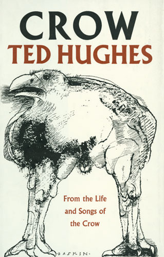
The generic postmodern Pentagram design that wrapped all Faber poetry titles from the early 80s onwards made me start thinking of Thomi Wroblewski, the designer I befriended and worked with from 1987 on. Thomi -- employed by Mike Alway to do the least el set of el single sleeves ever -- was known for his Talking Heads and Siouxie and the Banshees sleeves, as well as William Burroughs jackets for Picador:


 When we started collaborating, Thomi had a big studio above the office of maverick Scottish publisher John Calder, in Green's Court, just off Brewer Street in Soho. I ended up spending a lot of time there, meeting Calder and some of his unlikely hangers-on (the Jewish doctor from Eastenders!). Thomi shared my taste for refined erotica (he designed an edition of Apollinaire's 1907 smut classic Les Onze Mille Verges, which publisher Peter Owen had to paraphrase, so subversive was it still considered to be in 1980s Britain), and liked to photograph you naked, writhing like a dancer. So it was up in that Soho studio that I posed, naked and masked, with various pretty girls for the Murderers, The Hope of Women sleeve. Thomi even dressed me up as dandy barfly Julian Maclaren-Ross, and put me on the cover of Memoirs of the Forties, his book about Fitzrovia. I'm seen from behind, toasting Soho.
 What I notice about Thomi Wroblewski's 1980s book jacket work now is that while it often transgresses against the standards of good taste, it has an interesting maverick diversity -- exactly the sort of quirky zing that Wolpe-period Faber books had, but Pentagram-period Faber had lost by the time they standardised their poetry line with the tight-assed, Laura-Ashley-like "pomo ampersand classic" design.
This period of 1980s late pomo design is now coming back with a rush; the stretched typefaces on Thomi's 1988 Quick End anthology, for instance (The Quick End was a collection of short stories by Michael Bracewell, Don Watson and Mark Edwards, a writing group formed under the tutelage of Kathy Acker -- I faithfully attended all their readings) look rather like what Mike Meiré is doing now at 032c magazine. There's an awkward, ugly energy here which suddenly looks interesting again.
(no subject)
Date: 2009-07-13 10:47 am (UTC)(no subject)
Date: 2009-07-13 11:37 am (UTC)Congrats on a very original book. Am intreagued by the other releases in the 'Solutions' series now!
James
(no subject)
Date: 2009-07-13 11:45 am (UTC)(no subject)
Date: 2009-07-13 11:53 am (UTC)(no subject)
Date: 2009-07-13 12:02 pm (UTC)(no subject)
Date: 2009-07-13 12:05 pm (UTC)(no subject)
Date: 2009-07-13 12:45 pm (UTC)which is referencing early modernism and therefore retro and postmodern, although utterly different in intent to the Faber covers. But if everything is postmodern, then the term no longer means anything, does it? What would be an example of non-postmodernism in the eighties?
(no subject)
Date: 2009-07-13 12:52 pm (UTC)Worth adding: the Mendelson jacket (http://static.guim.co.uk/sys-images/Guardian/Pix/pictures/2009/7/10/1247222490516/Eighty-Years-of-Book-Cove-009.jpg) does link much more clearly to Zak Kyes' (ahem) altermodern jacket for my Book of Scotlands (http://www.sternberg-press.com/files/book/137/solution_scotlands_cover_364.jpg). They both use (something like) the efficient "transport font" Johnston and they both look "Orwellian", uptopian-dystopian, propagandistic.
Just as a reference to Victorian motifs would have been unthinkable for modernists -- because its identity would have been threatened by attempts to integrate the still-potent styles of the Victorian era -- so a reference to Modernist motifs would have been difficult for postmodern design. The recent past had to be swept under the carpet, banished to the anxious interval (http://imomus.livejournal.com/435556.html).
The altermodern period we're now entering (and we may call it something else in the end) was heralded by a "return of the repressed" -- the sudden re-emergence of Modernist themes suppressed during the era of Postmodernism. One of the key slogans of this "return": "Modernity is our antiquity".
(no subject)
Date: 2009-07-13 12:55 pm (UTC)It's true that pomo was the dog that could eat anything, and I think everything produced in the 80s was necessarily postmodernist for this reason. I think we'd have to then start quibbling about how the dog ate things, and in what context, to distinguish a 1980 Modernist reference from a 2010 Modernist reference.
wrapping books
Date: 2009-07-13 01:00 pm (UTC)Thomas
(no subject)
Date: 2009-07-13 01:49 pm (UTC)Actually, don't we have to get away from the idea that anything that references the past is necessarily postmodern? After all, plenty of modernists referenced the past. Lots of modernists were obsessively working images from the Old Masters; the Die Brucke people were into medieval woodcuts etc etc. What makes something postmodern must be to do with the way it references the past, not just the fact that it does it.
(no subject)
Date: 2009-07-13 01:49 pm (UTC)Re: wrapping books
Date: 2009-07-13 01:52 pm (UTC)(no subject)
Date: 2009-07-13 02:04 pm (UTC)Exactly what I was trying to say with "I think we'd have to then start quibbling about how the dog ate things, and in what context". Thanks!
(no subject)
Date: 2009-07-13 02:51 pm (UTC)(no subject)
Date: 2009-07-13 02:53 pm (UTC)(no subject)
Date: 2009-07-13 03:15 pm (UTC)(no subject)
Date: 2009-07-13 03:54 pm (UTC)I appreciate the Japanese insistence on uniform, I appreciate the Japanese insistence on strict etiquette... but this is crossing the line into creepy and strange, even by Japanese standards.
(no subject)
Date: 2009-07-13 04:08 pm (UTC)(no subject)
Date: 2009-07-13 04:19 pm (UTC)(no subject)
Date: 2009-07-13 05:36 pm (UTC)Today I am wearing a white turtleneck and I look lexactly ike, well... your penis.
(no subject)
Date: 2009-07-13 05:52 pm (UTC)'Jokes'
Date: 2009-07-13 06:17 pm (UTC)(no subject)
Date: 2009-07-13 06:39 pm (UTC)of course this may pertain more to Modernist lit than other arts and disciplines.
(no subject)
Date: 2009-07-13 06:43 pm (UTC)Re: 'Jokes'
Date: 2009-07-13 07:23 pm (UTC)(no subject)
Date: 2009-07-13 08:10 pm (UTC)(no subject)
Date: 2009-07-13 08:14 pm (UTC)Yeah, whatever Marcel.
Re: wrapping books
Date: 2009-07-13 09:16 pm (UTC)(no subject)
Date: 2009-07-13 11:58 pm (UTC)(no subject)
Date: 2009-07-14 04:19 am (UTC)but, that it's "the" truth is not very postmodern. if you had said it's "a" truth, then we'd be in business...
(no subject)
Date: 2009-07-14 04:52 am (UTC)(no subject)
Date: 2009-07-14 07:00 am (UTC)(no subject)
Date: 2009-07-14 07:11 am (UTC)(no subject)
Date: 2009-07-14 07:27 pm (UTC)